Visualising UK Covid19 data with Clojure and Oz
Discover how to use Oz, a Clojure library for visualising data, to build a dashboard of information about the Covid19 virus from available UK data.
practicalli/covid19-dashboard contains the code from this article.
Data science is about gathering meaningful data and presenting that data in meaningful ways, enabling business or communities to have tools to better understand a stituation. Data sets are often flawed and visualisation open to interpretation, so no clear picture is offered about the current Covid19 pandemic.
Covid19 virus is a very serious pandemic affecting the world at present, please stay safe and where possible at home and away from others to help stop the spread of this highly infectious virus.
Examples of visualisations
The UK government provides a Covid-19 tracker of reported cases and is a useful example of a data science dashboard.
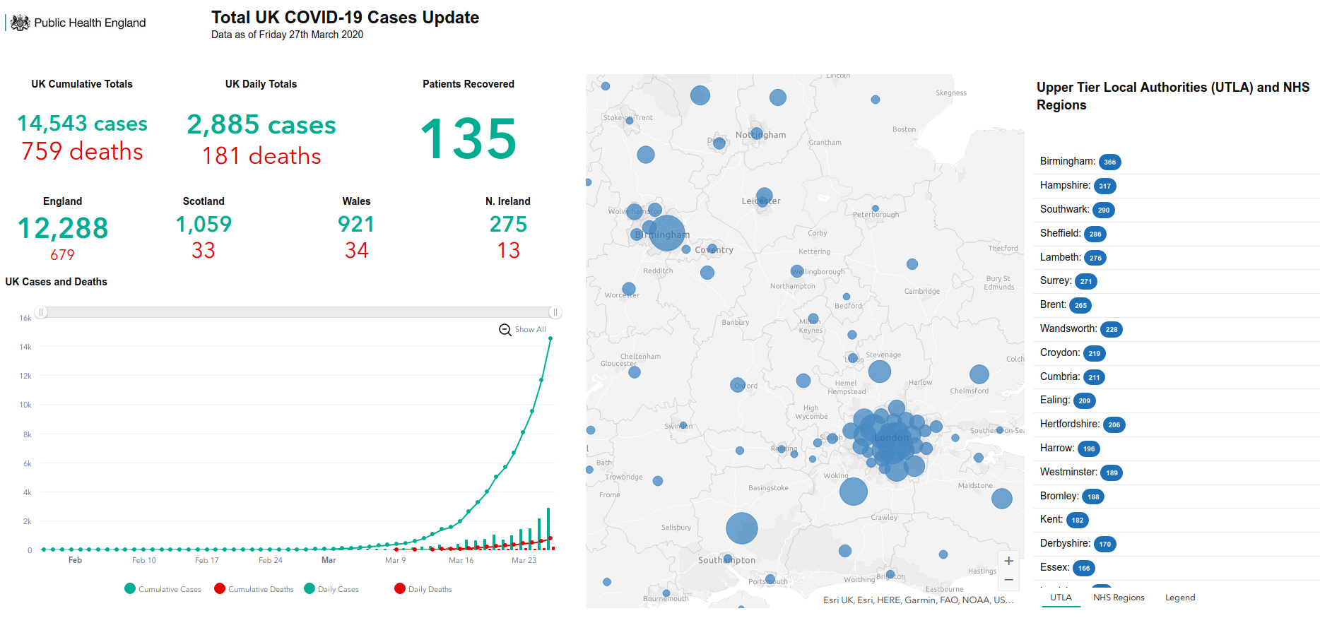
Other excellent dashboard examples include:
Mining for data
Good data can be hard to find and often needs cleaning. Luckily the UK Government has shared the data used for the Covid-19 tracker.
There are several Excel spreadsheets containing different views of the data
- Daily indicators - used for the headline figures each day
- Daily confirmed cases - data from 29th February to previous day (count each day, cumulative cases, daily deaths, cumulative deaths).
Creating a Clojure project
Dave L created a very useful sample application you could extend (required Leiningen build tool), or create a new Clojure project
clojure -A:new app practicalli/covid19-dashboard
Add Oz as a dependency in deps.edn
 :deps
 {org.clojure/clojure {:mvn/version "1.10.1"}

  metasoarous/oz {:mvn/version "1.6.0-alpha6"}}
Require Oz in the practicalli.covid19-dashboard namespace
(ns practicalli.covid19-dashboard
  (:gen-class)
  (:require [oz.core :as oz]))
Finally add an explicitly call to the Oz server. This will listen via websockets for views to display.
(oz/start-server!)

The message suggests that a plot function (e.g. oz/view!) will start the server if not explicitly called.
Create a view with Mock data
(defn play-data [& names]
  (for [n names
        i (range 20)]
    {:time i :item n :quantity (+ (Math/pow (* i (count n)) 0.8) (rand-int (count n)))}))
Extracting the data
The data is in Microsoft Excel files, even though its just simple table data. I opened the files in LibreOffice and saved them as plain text csv files.
Transforming the data for visualisation
The data needs to be transformed into a structure that can be used to visualise the data.
This adds
:data wraps the original sequence of data in a hash-map with a key named :values.
:mark is the type of visualisation to use, e.g. bar chart, line graph, etc.
:encoding defines how the data will be presented, matching the :field with the data keyword and the
Creating Oz views
Oz is based on the grammar of interactive graphics as defined for Vega-lite specifications.
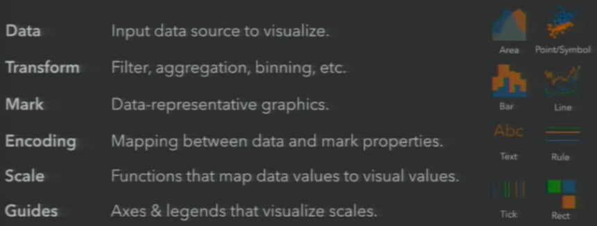
Which can generate a range of graphs and plots
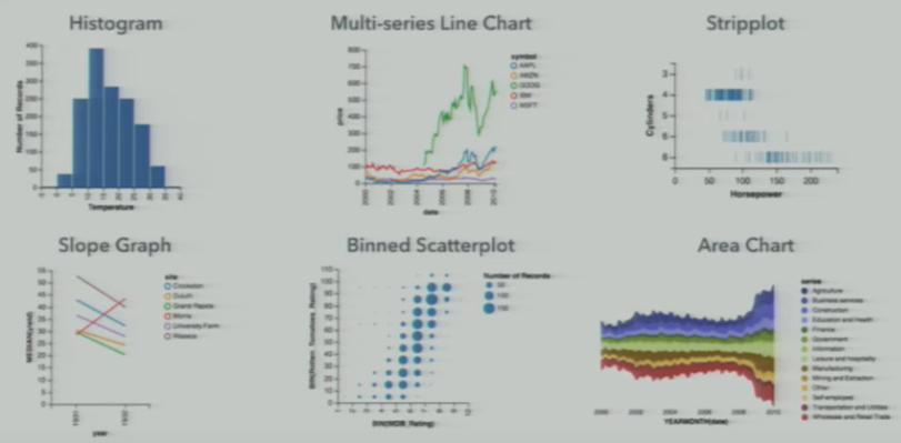
Watch Vega Lite: A Grammar of Interactive Graphics for more examples (more examples will be covered in later articles here).
Line graph
Show the cumulative cases for each location as a separate line on the graph
(def line-plot
  "Transform data for visualization"
  {:mark     "line"
   :data     {:values (mock-data-set "England" "Scotland" "Wales" "Northern Ireland")}
   :encoding {:x     {:field "day" :type "quantitative"}
              :y     {:field "cases" :type "quantitative"}
              :color {:field "location" :type "nominal"}}})

(oz/view! line-plot)
The encoding field names match the keywords in the data values
Histogram - bar chart
A bar chart showing a cases comparison between locations on the same day.
(def stacked-bar
  {:mark     "bar"
   :data     {:values (mock-data-set "England" "Scotland" "Wales" "Norther Ireland")}
   :encoding {:x     {:field "day"
                      :type  "ordinal"}
              :y     {:aggregate "location"
                      :field     "cases"
                      :type      "quantitative"}
              :color {:field "location"
                      :type  "nominal"}}})

(oz/view! stacked-bar)
Creating a dashboard
Once all the views are created and recieving the relevant data, its a simple matter to create a dashboard using the hiccup style syntax that is common in Clojure.
Hiccup syntax is the clojure approach to representing HTML content and structure, along with CSS styles. Instead of open and closing tags, a Clojure vector respresents the scope of a tag and a keyword represents the type of tag.
[:div
  [:h1 "Title of the Dashboard"]]
Lets add the views we created already created.
(def dashboard
  [:div
   [:h1 "COVID19 Tracker - Mock data"]
   [:p "Mock data to experiment with types of views"]
   [:div {:style {:display "flex" :flex-direction "row"}}
    [:vega-lite line-plot]
    [:vega-lite stacked-bar]]])

(oz/view! dashboard)
Resources
- Vega-Lite online editor with examples - a quick way to try out visualisations and see example code
- Vega-Lite documenttion
- Vega slack community self-signup